Problem
Short-term rental operators are sold “all-in-one” platforms constantly, and the landing pages are interchangeable: a wall of feature names, a stock photo of a laptop, and the word AI used as a mood rather than a mechanism. The operator reading them manages eleven units across two cities and has about ninety seconds. The design problem was not making the page look premium. It was making an automation product legible fast enough to survive that ninety seconds.
Then there was a second problem I set for myself. A convincing SaaS landing page is built out of proof — dashboards, metrics, customer quotes. I had none of it. No product, no users, no data. Most concept work solves this by inventing the proof and hoping nobody asks. I wanted a page that still reads as a real landing page but cannot be mistaken for a real offer.
Role
Sole designer and front-end developer. I defined the concept and its positioning, wrote every line of copy, built the information architecture around the buyer's objections, designed the visual language and the motion, coded the whole page by hand in HTML, CSS and vanilla JavaScript, handled the accessibility work, and designed the disclosure system that keeps the invented data honest. Ideation and copy exploration were AI-assisted; the editorial judgement and the build were mine.
Process
- Structure the page around objections, not features I wrote down the questions an operator asks in the order they ask them: what is this, can I actually see it, what does it do all day, why not the tool I already pay for, does it work for properties like mine, who else uses it, and what am I still unsure about. Then I made each section answer exactly one of them. The section order is the objection order — that is the conversion flow, and it is why the comparison table sits immediately after the feature tabs rather than at the bottom.
- Use AI for divergence, keep judgement human I used AI to widen the search space rather than to write the page: generating objection lists from an operator's point of view, producing many headline and feature-name variants, and pressure-testing my structure by arguing against it. Almost all of that output was discarded. What it bought was speed at the stage where speed matters — exploring twenty framings in an hour instead of three — after which the selection, the rewriting, and the voice were done by hand.
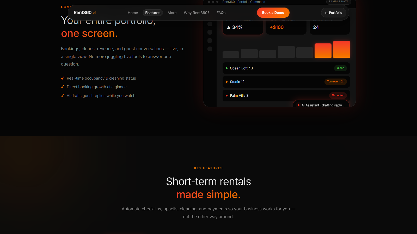
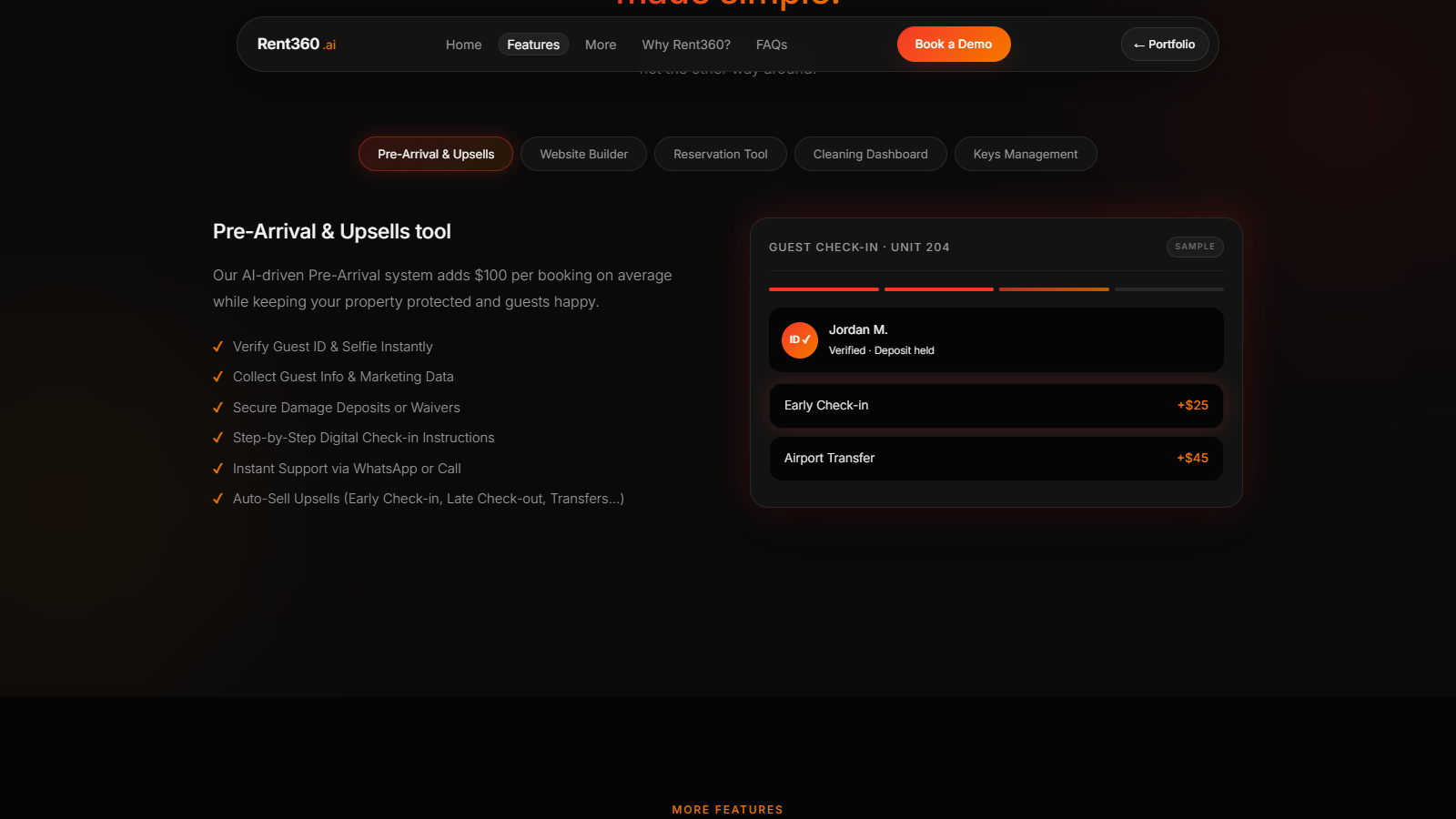
- Build the product mocks as real components The Command Center and all five feature panels are live HTML and CSS, not exported images. Counters count up, chart bars grow, statuses carry colour, and the assistant sits in a drafting state. This cost noticeably more time than dropping in flat mockups, and it paid for itself three times: the concept stays editable without reopening a design tool, the mocks inherit the accessibility and responsive behaviour of the rest of the page, and building them proved the interface was actually constructible rather than merely renderable.
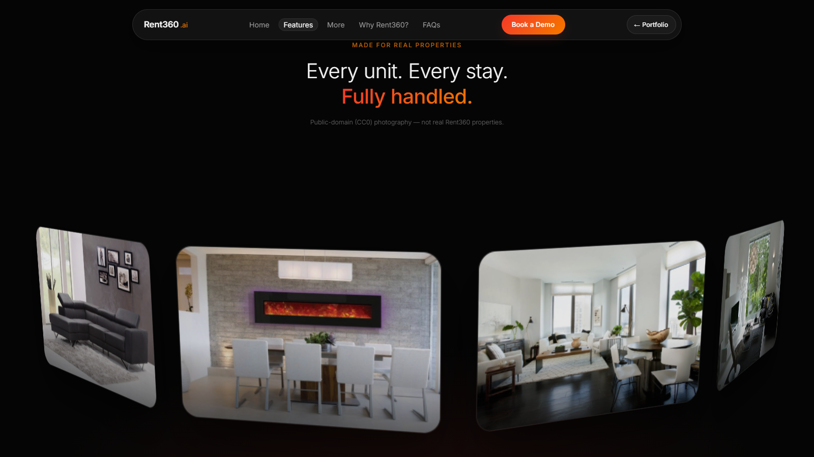
- Make the motion carry the argument The hero is a constellation with “AI autopilot” at the centre and eleven operational concerns — pricing, messaging, cleaning, keys, reviews — orbiting it. That is the value proposition drawn as a diagram instead of asserted as a sentence. Further down, a scroll-driven ring of property photographs rotates a full turn as you pass through it, giving the abstract word “portfolio” something physical to attach to. All of it is disabled under prefers-reduced-motion, because motion that carries meaning still cannot be the only way meaning arrives.
- Label every invented number A concept showing “direct bookings up 34%” is making a claim, whether or not it means to. So the page declares itself: a design-concept notice sits in the hero above the headline, every mock interface carries a “Sample data” chip in its own chrome, the ROI badge is marked illustrative, the testimonials are attributed to “Placeholder operator” and say outright that Rent360 has no customers, and the gallery states that the photography is public domain and not real properties. The footer names the brand as fictional. None of it breaks the illusion of a landing page — it just makes the illusion impossible to mistake for an offer.
UI system
Rent360 deliberately does not use the gothic Cinzel language of the rest of this site. A rental operator evaluating software brings SaaS expectations with them, and fighting those expectations would have cost comprehension for no gain. So the concept runs its own system: near-black surfaces, a thin geometric sans, fully rounded pill controls, and a red-to-orange accent that is the only saturated colour on the page.
Type: Inter 300–700 — headlines set in light weights at large sizes so scale carries the emphasis instead of boldness. Radii: 999px for every control, 28px and 20px for cards. One accent gradient, used for primary action and highlighted words only.
Screens
Captured from the live page at 1600 × 900.

Decisions worth defending
- There is no pricing section. Every competitor has one and its absence is the most visible gap in the page. A price is the one element a concept cannot invent without genuinely misleading someone, so the demo request carries the conversion instead.
- No framework and no build step. The page is hand-written HTML, CSS and about 375 lines of vanilla JavaScript, with one CDN library for smooth scrolling. For a single marketing page, a bundler would have added tooling to maintain and milliseconds to the load without changing what a visitor sees.
- The testimonials name themselves as placeholders. Three invented quotes with invented headshots is the standard move and it is a small lie. Keeping the component but labelling its contents demonstrates the same layout work and costs nothing but a chip.
- The gallery photography was replaced with public-domain (CC0) work and a credits file published beside the images. The original photographs had no recorded source or licence, which made the page unusable in front of a client no matter how good it looked.
- Motion is decorative until it is load-bearing, then it must degrade. The orbit and the photo ring both carry meaning, so both have a reduced-motion path that keeps the content and drops the animation.
Tech stack
- HTML5
- CSS custom properties
- Vanilla JavaScript
- CSS 3D transforms
- Canvas 2D (particles)
- Lenis (smooth scroll)
- WAI-ARIA tab pattern
- prefers-reduced-motion
- Inter
- Cursor (AI-assisted)
Live concept
The page is live and scrollable. The motion is most of the argument, so it is worth opening rather than only reading about.
Open the Rent360 concept